Portfolio Risk Analytics and Performance Attribution with Pyfolio
I was lucky enough to have the chance to intern at
Quantopian this summer. During that time I
contributed some exciting stuff to their open-source portfolio analytics engine,
pyfolio, and learnt a truckload of
stuff while doing it! In this blog post, I’ll describe and walk through two of
the new features that I authored: the risk and performance attribution tear
sheets.
Risk Analytics
A well-known truth of algorithmic trading is that it’s insufficient to merely maximize the returns of your algorithm: you must also do so while minimizing the risk it takes on board. This idea is probably most famously codified in the Sharpe ratio, which divides by the volatility of the returns stream in order to give a measure of the “risk-adjusted returns”.
However, the volatility of returns is a rather poor proxy for the amount of “risk” that an algorithm takes on. What if our algo loaded all of its money in the real estate sector? What if the algo shorted extremely large-cap stocks? What if half of our portfolio is in illiquid, impossible-to-exit positions?
These are all “risky” behavior for an algorithm to have, and we’d like to know about and understand this kind of behavior before we seriously consider investing money in the algo. However, these formulations of risk are neither captured nor quantified by the volatility of returns (as in the Sharpe ratio). Finally, there is no easy, free, open-source way to get this sort of analysis.
Enter pyfolio’s new risk tear sheet! It addresses all the problems outlined
above, and more. Let’s jump right in with an example.
(This example risk tear sheet came from the original pull request, and may therefore be out of date)
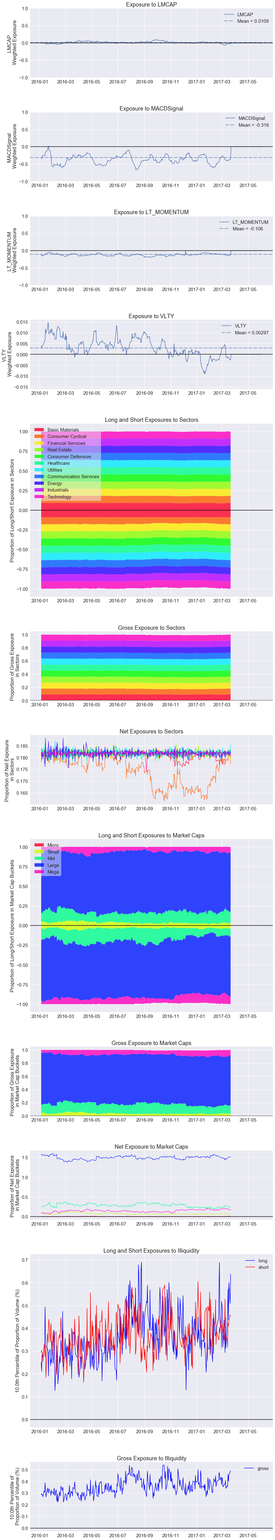
The first 4 plots show the exposure to common style factors: specifically, the
size of the company (natural log of the market cap), mean reversion (measured
by the MACD Signal), long-term
momentum, and volatility.
A style factor is best explained with examples: mean reversion, momentum,
volatility and the Fama-French canonical factors (SMB, HML, UMD) are all
examples of style factors. They are factors that indicate broad market trends
(instead of being characteristic to individual stocks, like sectors or market
caps) and characterize a particular style of investing (e.g. mean reversion,
trend-following strategies, etc.).
The analysis is not limited to 4 style factors, though: pyfolio will handle
as many as you pass in (but see below for a possible complication). As we can
see, the algorithm has a significant exposure to the MACD signal, which may or
may not worry us. For instance, it wouldn’t worry us if we knew that it was a
mean-reversion algo, but we would raise some eyebrows if it was something
else… perhaps the author wanted to write a wonderful, event-driven
sentiment algo, but inadvertently ended up writing a mean reversion algo!
One important caveat here is that pyfolio requires you to supply your own
style factors, for every stock in your universe. This is an unfortunately large
complication for the average user, as it would require you to formulate and
implement your own risk model — I explain this in greater detail below.
The next 3 plots show the exposures to sectors. This first plot shows us how much
the algorithm longed or shorted a specific sector: above the x-axis if it
longed, and below if it shorted. The second plot simply shows the gross exposure
to each sector: taking the absolute value of the positions before normalizing.
The last plot shows the net exposure to each sector: taking the long position
less the short position before normalizing. This particular algo looks
beautiful: it is equally exposed to all sectors, and not overly exposed to any
one of them. Evidently, this algo must be taking account its sector exposures
in its trading logic: given what we know from above, perhaps it is longing the
top 10 most “mean reverting” stocks in each sector at the start of every
week… This analysis requires no addition data other than your algorithm’s
positions: you can supply your own sectors if you like, but if not, the analysis
will default to the Morningstar sector
mappings
(specifically, the morningstar_sector_code field), available for free on the
Quantopian platform.
The next 3 plots show the exposures to market caps. In every other respect, it
is identical to the previous 3 plots. These plots look fairly reasonable: most
algos spend most of their positions in large and mega cap names, and have almost
no positions in micro cap stocks. (Quantopian actually discourages investing in
micro cap stocks by pushing users towards using the Q500 or
Q1500 as a tradeable
universe). This analysis uses Morningstar’s market cap
field.
The last 2 plots show the portfolio’s exposure to illiquidity (or low trading volume). This one is a bit trickier to understand: every the end of every day, we take the number of shares held in each position and divide that by the total volume. That gives us a number per position per day. We find the 10th percentile of this number (i.e. the most illiquid) and plot that as a time series. So it is a measure of how exposed our portfolio is to illiquid stocks. The first plot shows the illiquid exposure in our long and short positions, respectively: that is, it takes the number of shares held in each long/short position, and divides it by the daily total volume. The second plot shows the gross illiquid exposure, taking the absolute value of positions before dividing. So it looks like for this particular algo, for the 10% most illiquid stock in our portfolio, our position accounts for around 0.2–0.6% (not 0.002–0.006%!) of market volume, on any given day. That’s an acceptably low number! This analysis obviously requires daily volume data per stock, but that’s freely available on Quantopian’s platform.
That’s it for the risk tear sheet! There are some more cool ideas in the works (there always are), such as including plots to show a portfolio’s concentration risk exposure, or a portfolio’s exposure to penny stocks. If you have any suggestions, please file a new GitHub issue to let the dev team know! Pyfolio is open-source and under active development, and outside contributions are always loved and appreciated. Alternatively, if you just want to find out more about the nuts and bolts (i.e. the math and the data) that goes into risk tear sheet, you can dig around the source code itself!
Risk Models and Performance Attribution
There are two things in the discussion of the risk tear sheet that are worth talking about in further detail:
- I mentioned how the computation of style factor exposures (i.e. the first 4 plots) required your own “risk model” (whatever that is), and
- It was nice that we can guess at the inner workings of the algo, just by seeing its exposure to common factors. E.g., I guessed that the example algo was a sector-neutral mean reversion algo, because it was equally exposed to all 11 sectors, and had a high (in magnitude) exposure to the MACD signal.
I’ll talk about both points in order.
In order to find out your exposure to a style factor, you obviously must first know how much each stock is affected by the style factor. But how do you get that? That is what a risk model is for!
At the end of every period (usually every trading day), the risk model wakes up, looks at all the pricing data and style factor data for that day. It then tries to explain as best it can how much each stock was affected by each style factor. The end result is that each stock will have a couple of numbers associated with it, one for every style factor. These numbers indicate how sensitive the stock’s returns were to movements in the style factors. These numbers are called factor loadings or betas (although I prefer “factor loadings” because a lot of things in quant finance are called “beta”).
Even better, there’s no reason why the risk model should limit itself to style factors! I previously made the distinction between style factors and other factors such as sectors: theoretically, a risk model should also be able to find out how sensitive a stock’s returns are to movements in its sector: compute a “sector factor loading”, if you will. Collectively, all the factors that we want the risk model to consider — be they sector, style or otherwise — are called common factors.
Clearly, having a risk model allows us to do a whole lot of stuff! This is because, if we want to know how style factors and other prevailing market trends are affecting our portfolio, we must first know how they affect the stocks in our portfolio. Or, to be a bit more ambitious, if we knew how style factors and prevailing market trends are impacting our universe of stocks, then we’re well on the way to knowing how they’re impacting our portfolio! The value of this kind of portfolio analysis should, of course, be self-evident.
So, suppose we have a risk model. How do we get from a stock-level understanding of how market trends are affecting us, to a portfolio-level understanding of the same? The answer to this question is called performance attribution, and is one of the main reasons a risk model is worth having.
Instead of prattling on about performance attribution, it’d just be easier to show you the miracles it can do. Below are some (fake, made up) examples of some analysis performance attribution can give us:
Date: 08–23–2017

Factor            PnL ($)
--------------   --------
Total PnL          -1,000
Technology             70
Real Estate           -40
Momentum             -780
Mean Reversion        100
Volatility           -110
Stock-Specific        480
The table shows that today, our algo suffered a $1000 loss, and the breakdown of that loss indicates that the main culprit is momentum. In other words, our poor performance today is mostly attributable to the poor performance of the momentum factor (hence the name, “performance attribution”). The sector factors account for very little PnL, while the other style factors (mean reversion and volatility) drive fairly significant profits and losses, but the real smoking gun here is the fact that momentum completely tanked today.
There are a few more useful summary statistics that performance attribution can give us! Traditional computations for the alpha and the Sharpe ratio of a strategy usually take into account the performance of the market: i.e., the traditional alpha is a measure of how much our strategy outperformed the market, and the traditional Sharpe ratio is a measure of the same, but accounting for the volatility of returns. These may be dubbed single-factor alphas, because they only measure performance once one factor has been accounted for — namely, the market. In reality, we would like to not only account for the market, but also any other common factors, such as style or sector. This leads to the concept of the multi-factor alpha and Sharpe ratio, which is exactly the same as the alpha and Sharpe ratio we’re familiar with, but taking into account a lot more factors. In other words, whereas the returns in excess of the market is quantified by the single factor alpha, the returns in excess of the market, momentum, mean reversion, volatility etc., is quantified by the multi factor alpha. The same goes for the single factor and multi factor Sharpe, in the case of risk-adjusted returns.
Adding performance attribution capabilities to pyfolio is an active project! A
couple of pull requests have already been merged to this effect, so definitely
stay tuned! A new version of pyfolio will probably be made once performance
attribution is up and running. As always, feel free to
contribute to pyfolio, be it by
making feature requests, issues with bugs, or submitting a pull request!
Update (12–16–2017): Quantopian recently launched their risk model for anyone to use — this is a great resource that usually only large and deep-pocketed financial institutions have access to. Check it out here.
Update (05–11–2018): Quantopian’s now integrated pyfolio analytics into their backtest engine! This makes it much easier to see how your algorithm stacks up against expectations. Check out the announcement here.
Update (05–29–2018): Quantopian recently published a white paper on how the risk model works! Read all about it here.
Update (12-16-2020): Quantopian has been acquired by
Robinhood.
Sorry for all the broken links to www.quantopian.com.